UI and customization
Changing parameters is straightforward and easy. You can have a tailor-made design and a smooth appearance within seconds. It is possible, among others, to adjust integrated player controls, icons, background color, add a poster, change the cursor etc. Of course, you can also disable all built-in styles. In this manual, we will go through customizable elements so that H5Live Player UI will suit all your needs.
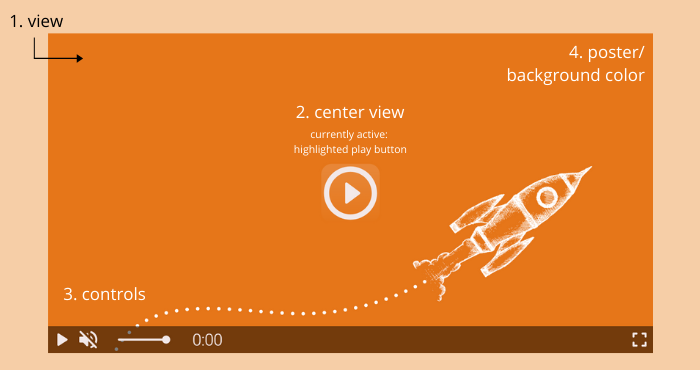 Screenshot: H5Live Player View with Poster
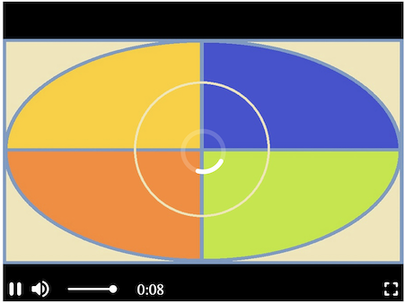
- View: Video overlayer including visible styles, controls and poster/background.
- Center View: Can include play button [see example above], loading animation, mute/volume icon.
- Controls: Control bar with play/pause control, mute control, volume control (slider), playback time, fullscreen control.
- Poster / background: A poster [image of your choice] that can be set and the background color can be changed.
Below you have a short description of each property and how-to for adjusting styles.
Built-in controls, animations and styles
The nanoStream H5Live Player Version 4.9.1 is introducing new possibilities in terms of design. The control bar and control icons background colors are customizable. The player is more vivid due to additional button behavior: buttonHighlighting, buttonAnimation and a variety of available cursors with buttonCursor.
See the config here.
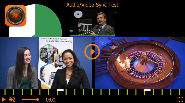
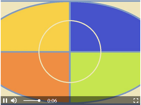
 Screenshot: Default style of the H5Live Player
symbolColor and controlBarColor
In config.style.symbolColor you need to pass the value of the desired color. The default value is "rgba(244,233,233,1)".
The control bar color background is set by default to "rgba(0,0,0,0.5)". To change it, insert the string with desired color value in config.style.controlBarColor.
To change one of the colors, insert its value in one of the formats (all case insensitive):
- RGB e.g.
"rgb(255,165,0)"and with alpha"rgba(255,165,0,0.5)" - HEX e.g.
"#FFA500"or"#fa0"and with alpha"#FFA500AA"or"#fa0a" - HSL e.g.
"hsl(39,100%,50%)"and with alpha"hsla(39,100%,50%,0.5)" - valid CSS Keyword (e.g.
"pink"/"white"/"aquamarine")
Example with HEX color value for symbolColor and controlBarColor:
"style": {
    "symbolColor"     : "#ed7d0e",
    "controlBarColor" : "#000000FF"
}
 Screenshot: Example with HEX color value for symbolColor and controlBarColor
Example with RGBA color value and transparency:
"style": {
    "symbolColor"     : "rgb(255,255,255)",
    "controlBarColor" : "rgba(237,125,14,0.8)"
}
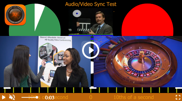 Screenshot: Example with RGBA color value and transparency
buttonHighlighting and buttonAnimation
Both properties add the 3D effect to the player and make it more lively.
buttonHighlightingon hover activates a shadow container of the buttonbuttonAnimationon hover magnifies the button and bounces when clicked
The config.style.buttonHighlighting and config.style.buttonAnimation properties will either be:
trueby default, means that they are displayedfalseto have them disabled
Example
"style": {
    "buttonHighlighting" : false,
    "buttonAnimation"    : false
}
buttonCursor
To change the cursor, you can use any CSS cursor property, e.g:
buttonCursor="default"buttonCursor="pointer"buttonCursor="grab"
The default value is set to "pointer". To change it, implement the string with the desirable CSS cursor in config.style.buttonCursor
Example
"style": {
    "buttonCursor": "default"
}
Changing the default value to "default", resolves in a switch from the pointing finger to an arrow while hovering over a clickable element.
Poster
Poster images, which are displayed while the video element is loading, are supported and can be added in the config.style.poster. The string has to be a relative or absolute path to a valid image source like "./assets/poster.png" or image URL.
Example
"style": {
    "poster": "https://[yourdomain]/assets/niceimage.png"
}
Background color of the player
To change the background color of the player set the backgroundColor parameter in config.style.backgroundColor to the desired color. By default, it is set to "black".
"style": {
    "backgroundColor": "white"
}
Responsiveness
To make the player responsive and preserve the aspect ratio, you need to set up player configuration and the CSS of playerDiv.
Player configuration
Set the style.width and style.height properties inside the player config to auto to keep the size of the parent container.
// player config
    var config = {
        "style": {
            "width"  : "auto",
            "height" : "auto"
        },
        ...
    }
playerDiv CSS
Set a percentage value for padding-bottom to maintain the aspect ratio of the players <div> element.
For a 16:9 aspect ratio: (9 / 16 = 0.5625) = 56.25%
    <body>
        <div id="playerDiv" style="width:100%;padding-bottom:56.25%"></div>
    </body>
Other aspect ratios
| Aspect ratio | padding-bottom |
|---|---|
| 1:1 | 100% |
| 16:9 | 56.25% |
| 4:3 | 75% |
Scaling Options
In video playback, scaling refers to the process of adjusting the size and aspect ratio of a video to fit within the dimensions of the player or display screen. Scaling is essential for ensuring that videos are displayed properly and optimally on various devices and screen sizes. Different scaling options are available to accommodate different aspect ratios and preferences, each offering unique benefits and considerations.
In H5Live player scaling can be adjusted in the config.style:
    "style": {
        "scaling": "crop"
    }
Modes:
Original graphic without scaling for comparison with each scaling option
Original graphic
- Letterbox
Letterboxing maintains the aspect ratio of the video by adding black bars to the sides or top and bottom of the video to fit it within the player's dimensions without stretching or cropping. This method is keeping the original aspect ratio.
By default, the scaling option is set to "letterbox".
Use Case: Ideal for maintaining the original aspect ratio of the video while ensuring it fits within the player's frame without distortion.
"scaling" : "letterbox"
Screenshot: H5Live Player scaling set to letterbox, 16:9 stream would look like this in a 4:3 player
- Crop
Cropping removes parts of the video frame to fit it within the player's dimensions, resulting in a loss of content from the original video. This method is keeping the original aspect ratio but could be removing parts of content.
Use Case: Useful when you want to fill the entire player frame with the video content, even if it means cropping parts of the original video.
"scaling" : "crop"
Screenshot: H5Live Player scaling set to crop, 16:9 stream would look like this in a 4:3 player
- Fill
Filling scales the video to completely fill the player's frame, potentially distorting the video if the aspect ratio of the video and player frame differs. This method is not prioritizing the original aspect ratio.
Use Case: Suitable for cases where filling the player frame with the video content is more important than maintaining the original aspect ratio, such as fullscreen playback.
"scaling” : "fill"
Screenshot: H5Live Player scaling set to fill, 16:9 stream would look like this in a 4:3 player
Other Customizations
The NanoPlayer exposes several configuration options to control how the player is rendered, from completely hiding the player UI to accessing the underlying media element directly.
Disable View Completely
Setting style.view to false removes all player chrome: controls, icons, overlays, and container
styling. You receive a plain media element: either a <video> or <canvas> depending on the
active playback mode with no visual wrapping from the player.
Since H5Live Player version 5.0.7 default CanvasElement behavior for MOQ playback with style.view: false is adjusted to match HTMLVideoElement behavior in MSE/HLS playback, ensuring similar display across all playback modes.
"style": {
    "view": false
}
When to use this:
- Embedding the stream as a background element
- Integrating the player into a design system where no default styling should be used
Disable built-in controls
Inline controls are set by default. However, it is possible to disable them by changing the value to false in config.style.controls.
"style": {
    "controls": false
}
If you create custom controls or other overlay elements make sure to set the z-index value > 10 to ensure they are positioned on top of the video layer.
Video Element vs. Canvas
Depending on the active playback mode, the player renders using different underlying elements:
| Playback mode | Element | Notes |
|---|---|---|
| MSE / HLS (h5live) | <video> | Standard HTML5 video element |
| MoQ / WebCodecs | <canvas> | Frames are decoded and painted by the player |
Applying your own styles
If you need to override default appearance, for example, to fill a container, apply a border, or set a background colour, target the player's wrapper rather than the media element directly:
/* Target the player wrapper */
#playerDiv {
    border-radius: 8px;
    overflow: hidden;
    background: #000;
}
Avoid setting width, height, or object-fit directly on the inner media element, as the player manages these internally.
Style as an audio-only player
To style the player as audio-only (without displaying the video element), it is enough to set the audioPlayer value to true in config.style.audioPlayer.
"style": {
    "audioPlayer": true
}

Screenshot: Style as an audio-only player
To customize audio-only control bar follow built-in controls customization.
Display audio-only stream
For audio-only stream, when there is no video, you can style the player to have a black background in the video frame and audio controls.
"style": {
    "displayAudioOnly": true
}
Hide fullscreen control
To hide fulscreen control icon set the fullscreen control to false in config.style.fullScreenControl.
"style": {
    "fullScreenControl": false
}
Other customizable parameters with a boolean value
It is possible to customize other parameters as well by setting them to true or false in config.style.[parameter], e.g.:
interactiveviewkeepFramecenterView
A list of all parameters available for styling can be found in NanoPlayer API in the config.style object.
Example code snippet with customization
In this example we want to change controlBarColor and symbolColor, replace the default buttonCursor and disable the buttonAnimation. In addition the playerDiv is styled responsive. For presentation, we insert all other customizable parameters within the style object. To try it out simply copy the snippet and paste it into a body of any HTML file (replace the streamname [your_streamname] with yours).
    <div id="playerDiv" style="width:100%;padding-bottom: 56.25%"></div>
    <script src="//demo.nanocosmos.de/nanoplayer/api/release/nanoplayer.5.min.js?20210127"></script>
    <script>
    var player;
    var defaultUrl = "rtmp://bintu-play.nanocosmos.de/play";
    var defaultServer = {
        "websocket": "wss://bintu-h5live.nanocosmos.de:443/h5live/stream",
        "hls": "https://bintu-h5live.nanocosmos.de:443/h5live/http/playlist.m3u8",
        "progressive": "https://bintu-h5live.nanocosmos.de:443/h5live/http/stream.mp4",
        "webtransport": "https://bintu-h5live.nanocosmos.de:443/h5live/stream/stream.mp4" // important for MOQ playback

    };
    var streamNames = [
        "[your_streamname]"
    ];
    var config = {
        "source": {
            "startIndex": 0,
            "entries": [
                {
                    "index": 0,
                    "h5live": {
                        "server": defaultServer,
                        "rtmp": {
                            "url"        : defaultUrl,
                            "streamname" : streamNames[0]
                        }
                    }
                }
            ]
        },
        "playback": {
            "autoplay" : true,
            "automute" : true,
            "muted"    : false
        },
        "style": {
            "width"                : "auto",
            "height"               : "auto",
            "controls"             : true,
            "interactive"          : true,
            "view"                 : true,
            "scaling"              : "letterbox",
            "keepFrame"            : true,
            "displayAudioOnly"     : true,
            "audioPlayer"          : false,
            "displayMutedAutoplay" : true,
            "backgroundColor"      : "rgb(237,125,14)",
            "fullScreenControl"    : true,
            "centerView"           : true,
            "symbolColor"          : "#FFF",
            "controlBarColor"      : "rgba(237,125,14,0.8)",
            "buttonAnimation"      : false,
            "buttonHighlighting"   : true,
            "buttonCursor"         : "grab",
            "poster"               : ""
        },
    };
    document.addEventListener("DOMContentLoaded", function () {
        player = new NanoPlayer("playerDiv");
        player.setup(config).then(function (config) {
            console.log("setup success");
            console.log("config: " + JSON.stringify(config, undefined, 4));
        }, function (error) {
            alert(error.message);
        });
    });
    </script>